web52

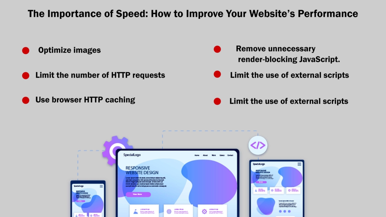
The Importance of Speed: How to Improve Your Website’s Performance

The Importance of Speed: How to Improve Your Website’s Performance

In today’s fast-paced digital landscape, website speed plays a critical role in user experience, SEO rankings, and overall business success. Users expect websites to load quickly; even a few seconds of delay can lead to higher bounce rates and lost opportunities. This article explores the importance of website speed and provides actionable tips for improving your site’s performance.


The Impact of Website Speed

User Experience: Fast-loading websites provide a better user experience, leading to higher engagement, longer session durations, and increased conversions. Users are more likely to abandon a slow website and may never return, which can harm your brand’s reputation.

SEO Rankings: Google and other search engines consider page speed a ranking factor. 

Mobile Performance: With the rise of mobile internet usage, ensuring your website loads quickly on mobile devices is crucial. Mobile users often have less patience for slow-loading sites, making optimization even more important.

Conversion Rates: Website speed directly affects conversion rates. Studies show that a one-second delay in page load time can lead to a significant reduction in conversions. A fast website can boost sales, sign-ups, and other key performance indicators.

How to Improve Your Website’s Speed

Optimize Images: Large, unoptimized images are one of the most common causes of slow websites. Implement responsive images to deliver the appropriate image size for different devices.

Minimize HTTP Requests: Each element on your webpage—images, scripts, stylesheets—requires an HTTP request. Reduce the number of requests by combining files, using CSS instead of images where possible, and minimizing the use of third-party scripts.

Enable Browser Caching: Browser caching stores static files on a user’s device, so they don’t need to be reloaded every time they visit your site. Set an appropriate caching expiration date for static resources.

Use a Content Delivery Network (CDN): A CDN distributes your website’s content across multiple servers worldwide, allowing users to download content from a server closer to them. This reduces load times and enhances performance, especially for international users.

Optimize Code: Minify CSS, JavaScript, and HTML files by removing unnecessary spaces, comments, and characters. This reduces file size and improves load times. Additionally, consider using asynchronous loading for JavaScript files to prevent them from blocking other elements on the page.

Implement Lazy Loading: Lazy loading delays the loading of non-critical elements, such as images and videos, until they are needed. This reduces initial load times and can improve the overall user experience, especially on content-heavy pages.

Optimize Web Hosting: Your choice of web hosting can significantly impact your website’s speed. Choose a reliable hosting provider with good server performance. Consider upgrading to a dedicated or VPS server if your website experiences high traffic.

Reduce Redirects: Each redirect adds additional HTTP requests and delays page rendering. Minimize the number of redirects on your site to improve load times.

These tools provide valuable insights into your site’s speed and offer recommendations for improvement.

Advanced Techniques for Website Speed Optimization

Implementing AMP (Accelerated Mobile Pages): AMP is a framework developed by Google that enables web pages to load almost instantly on mobile devices. By stripping down HTML and using a limited set of web technologies, AMP pages are lightweight and fast. Implementing AMP can significantly improve your mobile website’s load times and provide a better user experience, especially for users on slower networks.

Prefetching, Preloading, and Reconnecting: These techniques help browsers load resources more efficiently. Prefetching is used to load resources that might be needed in the near future, preloading instructs the browser to load critical resources as soon as possible, and reconnecting allows the browser to set up early connections to servers. These methods can reduce perceived load times and improve the smoothness of interactions on your website.

Gzip Compression: Enabling Gzip compression on your server can reduce the size of your HTML, CSS, and JavaScript files by up to 70%, speeding up their delivery to the user’s browser. Most modern web servers support Gzip, making it a relatively easy optimization to implement.

Optimizing Fonts: Custom web fonts can enhance your website’s design but can also add to the load time. To optimize font loading, consider using font-display: swap in your CSS to ensure text is visible while fonts are loading. Additionally, subset your fonts to include only the characters you need and use modern formats like WOFF2 for better compression.

Database Optimization: For websites that rely on databases (such as WordPress sites), optimizing the database can have a significant impact on speed. Regularly clean up unnecessary data, such as old revisions, spam comments, and transients. Use indexing to speed up query performance and consider a database optimization plugin if using a CMS like WordPress.

Optimizing Server Response Time: The server’s response time can affect how quickly your content is delivered. Optimize your server’s performance by choosing a hosting provider with low latency, keeping software up-to-date, and optimizing your database and application code. Using a service like New Relic can help you monitor and optimize server performance.

Asynchronous and Deferred Loading for Scripts: By default, the browser loads scripts synchronously, meaning they block the rendering of the page. To avoid this, use the async or defer attributes in your script tags. Async allows the script to load while the page continues to render, while defer delays the execution of the script until after the page has loaded.

HTTP/2 Protocol: Upgrade to HTTP/2 if your server supports it. This protocol allows multiplexing, which means multiple requests can be sent simultaneously over a single connection, significantly speeding up the loading of resources. HTTP/2 also supports header compression and server push, further enhancing performance.

Reducing Third-Party Scripts: While third-party scripts (such as analytics, ads, and social media widgets) can add valuable functionality to your website, they can also slow it down. Audit the third-party scripts on your site and remove any that are unnecessary. For essential scripts, ensure they are optimized and loaded asynchronously.

Using the Latest Technologies: Keep your website up-to-date with the latest web technologies and standards. For example, use modern image formats like WebP, which offers better compression than traditional formats like JPEG or PNG. Additionally, take advantage of browser capabilities such as HTTP/2 and modern JavaScript features to improve performance.

Measuring and Monitoring Performance

To ensure your website remains fast, it’s crucial to continuously monitor its performance. Use tools like:

Google PageSpeed Insights: Provides insights into how well your website performs and offers suggestions for improvements.

GTmetrix: Analyzes your site’s speed and provides a detailed report, including load time, page size, and request count.

Pingdom: Monitors website performance and provides real-time alerts if your site goes down or experiences slowdowns.

WebPageTest: Offers a detailed analysis of your website’s performance from different locations around the world.

The Ongoing Commitment to Performance

Improving website speed is not a one-time task but an ongoing commitment. As your website grows and evolves, new content, plugins, and features can affect performance. Regularly review your site’s speed and make adjustments as needed. Additionally, stay informed about the latest developments in web technologies and optimization techniques to keep your site at the cutting edge.

Conclusion

Website speed is a crucial factor that influences user satisfaction, search engine rankings, and business outcomes. By optimizing your site’s performance, you can provide a better experience for your users, increase visibility, and drive higher conversions. Implementing best practices such as image optimization, reducing HTTP requests, using a CDN, and optimizing code can significantly improve your website’s speed. As the digital landscape continues to evolve, maintaining a fast and efficient website will be key to staying competitive and meeting the expectations of your audience.

Address: 15th floor, Manjeera Trinity Corporate, KPHB, Hyderabad 500072

Mobile No.:+91 7981728810

Email id: info@skywebdev.in

Website: https://skywebdev.in/


aug-3-5

How to Plan and Execute a Successful App Launch Strategy

How to Plan and Execute a Successful App Launch Strategy 

Introduction:

Launching an app can be an exhilarating yet daunting task. The success of your app largely depends on the meticulous planning and execution of your launch strategy. This comprehensive guide will walk you through the key steps to plan and execute a successful app launch strategy, ensuring that your app not only reaches its target audience but also stands out in the crowded marketplace.

Understanding the App Market

Before diving into the specifics of your app launch strategy, it’s crucial to understand the app market landscape. This involves researching your target audience, identifying your competition, and understanding current market trends. Here’s how you can do it:

Market Research: Analyze the demographics, behaviors, and preferences of your target users. Tools like Google Analytics, App Annie, and Sensor Tower can provide valuable insights into user behavior and market trends.


Competitor Analysis: Identify your main competitors and analyze their strengths, weaknesses, and strategies. Look at their app reviews, ratings, and user feedback to understand what works and what doesn’t.

Trend Analysis: Stay updated with the latest trends in app development and marketing. This can help you incorporate innovative features and strategies that appeal to your target audience.

Defining Your Goals and Objectives

Setting clear goals and objectives is a critical step in your app launch strategy. These goals will guide your efforts and help you measure the success of your launch. Consider the following objectives:

User Acquisition: Determine how many users you aim to acquire within a specific timeframe.

Retention Rates: Focus on strategies to retain users and keep them engaged with your app.

Revenue Goals: If your app has a monetization model, set realistic revenue targets.

Brand Awareness: Establish metrics to gauge the level of brand awareness and recognition achieved through the launch.

Building a Pre-Launch Hype

Creating buzz before the launch is essential to ensure a strong start. Here are some effective pre-launch strategies:

Teaser Campaigns: Use social media, email newsletters, and your website to share sneak peeks, teasers, and countdowns to build anticipation.

Beta Testing: Conduct beta testing to gather feedback, identify bugs, and improve the app. Invite a select group of users to test the app and provide feedback.

Influencer Partnerships: Collaborate with influencers and bloggers in your niche to create buzz around your app. Their endorsement can significantly boost your app’s visibility and credibility.

Press Releases: Prepare press releases and reach out to tech bloggers, journalists, and media outlets to cover your app’s upcoming launch.

Landing Page: Create a landing page that highlights the app’s features, benefits, and launch date. Include a sign-up form to capture email addresses of interested users.

Crafting a Marketing Plan

A well-rounded marketing plan is crucial for a successful app launch. This plan should include various channels and tactics to reach and engage your target audience.

Content Marketing: Create engaging content that showcases your app’s features and benefits. This can include blog posts, videos, infographics, and social media posts.

Social Media Marketing: Leverage social media platforms to promote your app. Use paid ads, organic posts, and stories to reach your audience. Platforms like Facebook, Instagram, Twitter, and LinkedIn can be effective depending on your target demographic.

App Store Optimization (ASO): Optimize your app store listing to improve visibility and attract downloads. This includes using relevant keywords, creating an engaging app description, and using high-quality screenshots and videos.

Email Marketing: Send out email campaigns to your pre-launch subscribers, existing customers, and potential users. Highlight the app’s features, launch date, and any exclusive offers.

Paid Advertising: Invest in paid advertising campaigns on platforms like Google Ads, Facebook Ads, and Instagram Ads. These ads can help you reach a larger audience quickly.

Launch Day Execution

The day of the launch is critical, and meticulous planning is required to ensure everything goes smoothly.

Monitoring and Support: Have a dedicated team in place to monitor the app’s performance, address any issues, and provide support to users.

Social Media Engagement: Engage with your audience on social media by responding to comments, messages, and mentions. Encourage users to share their experiences and reviews.

Press Coverage: Ensure that your press releases are published on launch day. Follow up with journalists and bloggers to secure coverage.

Incentives and Promotions: Offer launch-day promotions, discounts, or exclusive content to encourage downloads and engagement.

Post-Launch Strategies

The work doesn’t end on launch day. Post-launch strategies are essential to maintain momentum and achieve long-term success.

User Feedback and Updates: Continuously gather user feedback and release updates to improve the app. Address any bugs, add new features, and enhance the user experience.

Retention Campaigns: Implement strategies to retain users and keep them engaged. This can include push notifications, in-app messages, and loyalty programs.

Analytics and Metrics: Monitor key metrics such as downloads, user retention, engagement rates, and revenue. Use tools like Google Analytics, Mixpanel, and Firebase to track performance and make data-driven decisions.

Community Building: Foster a community around your app through social media groups, forums, and in-app communities. Engage with your users, listen to their feedback, and make them feel valued.

Partnerships and Collaborations: Explore partnerships with other apps, brands, and influencers to expand your reach and attract new users.

Measuring Success

Measuring the success of your app launch is crucial to understand what worked and what didn’t. Here are some key metrics to track:

Download Numbers: The number of downloads is a clear indicator of your app’s initial success.

User Retention: The percentage of users who continue to use your app over time is crucial for long-term success.

Engagement Rates: Monitor how often and how long users engage with your app.

Revenue: Track your app’s revenue if you have a monetization model.

App Store Rankings: Higher rankings in app stores increase visibility and attract more downloads.

User Reviews and Ratings: Positive reviews and high ratings can significantly impact your app’s reputation and download rates.

Continuous Improvement

The app launch is just the beginning. Continuous improvement is essential to keep your app relevant and successful. Here’s how you can ensure ongoing success:

Regular Updates: Release regular updates to fix bugs, add new features, and improve performance.

User Feedback: Continuously gather and act on user feedback to enhance the app experience.

Market Trends: Stay updated with market trends and adapt your app to meet evolving user needs and preferences.

Competitive Analysis: Regularly analyze your competitors to identify opportunities for improvement and innovation.

Marketing Efforts: Keep your marketing efforts ongoing to attract new users and retain existing ones.

Conclusion

Planning and executing a successful app launch strategy requires careful planning, execution, and continuous improvement. By understanding the app market, setting clear goals, creating pre-launch hype, crafting a robust marketing plan, executing flawlessly on launch day, and implementing effective post-launch strategies, you can maximize your app’s chances of success.

Remember that the app launch is just the beginning. Continuous improvement, user engagement, and staying updated with market trends are essential for long-term success. With the right strategy and execution, your app can stand out in the crowded marketplace and achieve the success it deserves.

Address: 15th floor, Manjeera Trinity Corporate, KPHB, Hyderabad 500072

Mobile No.:+91 7981728810

Email id: info@skywebdev.in

Website: https://skywebdev.in/
aug-3-3 (1)

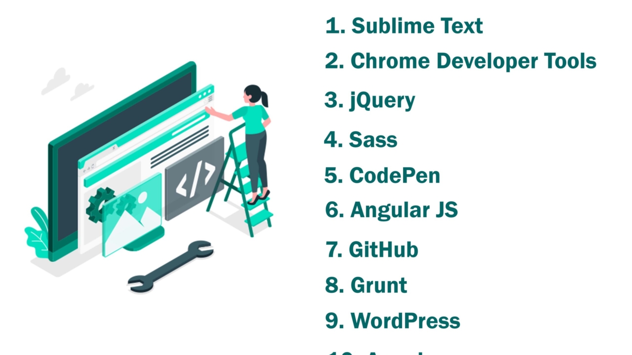
Top 10 Website Development Tools You Need to Know

Top 10 Website Development Tools You Need to Know

In the ever-evolving world of web development, having the right tools can make all the difference. From streamlining workflows to enhancing design capabilities, these tools are indispensable for developers aiming to create responsive, user-friendly, and visually appealing websites. Here, we explore the top 10 website development tools you need to know.


  1. WordPress

WordPress is a widely-used content management system (CMS) that powers over 40% of all websites on the internet. It’s known for its flexibility, ease of use, and extensive plugin ecosystem.

Features:

Themes: Choose from thousands of themes to customize the appearance of your site.

Plugins: Extend functionality with thousands of plugins available.

SEO Friendly: Built-in SEO tools to help improve your site’s visibility.

User Management: Manage multiple users with different roles and permissions.

WordPress is ideal for creating a wide range of websites, from blogs to e-commerce sites, due to its versatility and user-friendly nature.

  1. Sublime Text

Sublime Text is a sophisticated text editor known for its speed and efficiency. It is highly customizable, making it a favorite among developers who value simplicity and performance.

Features:

Goto Anything: Quickly navigate to files, symbols, or lines.

Command Palette: Access frequently used functions and commands easily.

Multiple Selections: Make bulk edits with multiple selections.

Split Editing: Edit files side-by-side in split view.

Distraction-Free Mode: Focus on coding with a full-screen, distraction-free mode.

Sublime Text’s lightweight nature and powerful features make it an excellent choice for web developers.

  1. Atom

Atom, developed by GitHub, is an open-source text editor that offers a hackable experience, allowing developers to customize it to their liking.

Features:

Teletype: Collaborate with other developers in real-time.

Smart Autocomplete: Provides intelligent code suggestions.

File System Browser: Easily browse and open files and directories.

Built-In Package Manager: Install, update, and manage packages directly from the editor.

Themes: Choose from a variety of themes to personalize your workspace.

Atom’s emphasis on collaboration and customization makes it a standout choice for developers who enjoy tweaking their tools.

  1. Bootstrap

Bootstrap is a popular front-end framework for developing responsive and mobile-first websites. It provides a collection of CSS and JavaScript components that simplify the design process.

Features:

Grid System: A flexible grid system for creating responsive layouts.

Pre-Built Components: A library of pre-styled components like buttons, modals, and navigation bars.

Customizable: Easily customize the framework to match your project’s needs.

Extensive Documentation: Comprehensive documentation and examples to guide you.

Bootstrap’s ease of use and robust feature set make it a go-to framework for front-end developers.

  1. Webpack

Webpack is a powerful module bundler for JavaScript applications. It takes modules with dependencies and generates static assets representing those modules.

Features:

Code Splitting: Split your code into smaller bundles for faster loading times.

Loaders: Transform files into modules as they are added to your dependency graph.

Plugins: Extend Webpack’s capabilities with a rich ecosystem of plugins.

Hot Module Replacement: Update modules in real-time without a full page reload.

Webpack is essential for optimizing the performance and manageability of modern JavaScript applications.

  1. GitHub

GitHub is a web-based platform for version control and collaboration, allowing developers to host and review code, manage projects, and build software together.

Features:

Repository Hosting: Host your code in repositories with version control.

Pull Requests: Review and discuss proposed changes before merging them.

Issues and Project Management: Track bugs, enhancements, and manage project milestones.

Actions: Automate workflows directly from your repository.

GitHub’s collaborative features and integration with other development tools make it an indispensable platform for developers.

  1. Figma

Figma is a web-based design tool that enables collaborative interface design. It’s particularly useful for teams that need to work together in real-time on design projects.

Features:

Real-Time Collaboration: Multiple team members can work on the same design simultaneously.

Prototyping: Create interactive prototypes to showcase design functionality.

Design Systems: Manage and reuse design components with ease.

Vector Networks: Advanced vector editing tools for precision design.

Figma’s focus on collaboration and robust design capabilities make it a top choice for UI/UX designers.

  1. Jira

Jira is a powerful project management tool designed for agile teams. It helps teams plan, track, and release software efficiently.

Features:

Agile Boards: Use Kanban or Scrum boards to manage workflows.

Roadmaps: Plan and visualize your project’s progress with roadmaps.

Reporting: Generate detailed reports on team performance and project status.

Integrations: Integrate with other tools like GitHub, Bitbucket, and Slack.

Jira’s comprehensive project management features make it an essential tool for development teams.

  1. Visual Studio Code

Visual Studio Code (VS Code) is a free, open-source code editor developed by Microsoft. It has gained immense popularity due to its versatility, robust features, and extensive customization options.

Features:

Integrated Terminal: Execute commands directly within the editor.

Extensions: Thousands of extensions available to enhance functionality.

IntelliSense: Advanced code completion, syntax highlighting, and real-time error detection.

Git Integration: Seamlessly manage version control with built-in Git support.

Debugging: Powerful debugging tools to troubleshoot your code.

VS Code is ideal for both beginners and seasoned developers due to its user-friendly interface and powerful capabilities.

  1. Chrome DevTools

Chrome DevTools is a set of web developer tools built directly into the Google Chrome browser. It provides powerful debugging and performance analysis capabilities.

Features:

Element Inspector: Inspect and modify the DOM and CSS in real-time.

Console: Log information and interact with JavaScript.

Network Panel: Analyze network activity and optimize load times.

Performance Panel: Record and analyze performance data to improve page speed.

Application Panel: Inspect storage, cache, and service workers.

Chrome DevTools is essential for debugging and optimizing websites, making it a must-have tool for web developers.

Conclusion

Choosing the right tools can significantly enhance your web development workflow and project outcomes. Visual Studio Code, Sublime Text, Atom, Bootstrap, Webpack, GitHub, Figma, Jira, WordPress, and Chrome DevTools are among the top tools that can help you build efficient, responsive, and visually appealing websites. Each of these tools offers unique features that cater to different aspects of web development, from coding and design to project management and optimization.

By integrating these tools into your workflow, you can streamline your development process, improve collaboration, and ultimately deliver better websites that meet the needs of your users and clients. Whether you’re a beginner or an experienced developer, these tools are invaluable assets that can help you stay ahead in the competitive world of web development.

Address: 15th floor, Manjeera Trinity Corporate, KPHB, Hyderabad 500072

Mobile No.:+91 7981728810

Email id: info@skywebdev.in

Website: https://skywebdev.in/

aug-3-2[1]

How to Build a Website That Drives Conversions

How to Build a Website That Drives Conversions

Introduction

In today’s online world, having a good website is very important to attract potential customers and help your business grow. A great website helps guide visitors smoothly, offering a good user experience that makes them more likely to convert. By improving key parts of your website, you can turn visitors into loyal customers and increase your conversion rate.


8 Key Elements to Enhance Your Website’s Conversion Rate

Driving more actions on your website needs a smart plan. It’s about helping visitors do what you want them to do. This could be buying something, signing up for a newsletter, or reaching out to your team.

Let’s look at eight key parts that can turn your website into a place that gets results. By focusing on these parts, you can make a site that speaks to your target audience and produces real benefits for your business.

  1. Compelling and Clear Value Proposition

A clear value proposition is very important for attracting potential customers and helping them through the conversion funnel. It’s about showing the unique benefits of your product or service. You need to explain why it is the best choice for their needs. This clear message lets visitors quickly understand what you offer, making them more likely to explore your website.

Your value proposition should be easy to find on your landing page. Talk about the key problems your product or service solves and show the good results customers can expect. A strong value proposition helps to build trust and credibility, leading to more conversions.

By clearly stating your value proposition, you give visitors a good reason to pick your offerings instead of your competitors.It’s about showing how it helps your potential customers directly.

  1. User-Friendly Site Layout and Navigation

A friendly site layout and easy navigation are very important. They help visitors have a smooth time browsing. Users should find what they need quickly and easily, with no frustrating dead ends. Making the user journey simple with clear menus, helpful links, and a smart website structure helps people explore your content.

When visitors can easily navigate your site, it creates a good user experience. This makes them want to spend more time looking at what you offer. But if the layout is confusing or poorly made, it can lead to frustration and high bounce rates. Simplifying your website’s setup, using clear labels, and optimizing browsing flow are all key to keeping visitors interested and guiding them towards taking action.

A user-friendly website design focuses on clear and easy use. By simplifying navigation and showing information clearly, you help visitors find what they want. This makes them happier overall and boosts the chances of getting conversions.

  1. Optimization of Call-to-Action Buttons

Optimizing your call-to-action (CTA) buttons is very important for boosting your conversion rate. A good CTA button should catch the visitor’s eye and make them want to click. Using strong action words, creating urgency, and showing the benefits can greatly improve how well your button works.

For example, instead of just saying “Learn More,” you could try “Unlock Exclusive Content” or “Boost Your Sales Today.” The goal is to make CTA buttons that are attractive, focused on benefits, and match what the visitor is looking for. Regularly doing A/B testing on different CTA button designs, places, and messages helps find out what your target audience likes most. This can lead to better conversion rates.

Keep in mind that your CTA buttons are the way to turn visitors into customers. By improving their design and placement, you can help guide visitors to take the actions you want and increase your website conversion.

  1. Customer Testimonials and Trust Signals

Building trust is very important. By using customer testimonials, reviews, and other trust signals, you can greatly improve your credibility. Testimonials are a smart way to show social proof. They highlight the good experiences of past customers. When potential customers see real people supporting your product or service, it makes them feel more confident and encourages them to buy.

Here are some good ways to show testimonials:

Dedicated Testimonial Page: Add a special page on your website that has a list of strong customer testimonials.

Homepage Highlights: Put short positive reviews on your homepage to grab immediate attention.

Case Studies: Make detailed case studies that show how your product or service has helped real customers face their problems and find success.

By adding these trust signals across your website, you can build credibility, connect with visitors better, and increase the chances of them choosing what you offer.

  1. Speed Optimization for Faster Loading Times

In today’s quick-moving digital world, speed is very important for a good user experience. Website visitors don’t have patience for slow pages. They often leave a site that takes too long to load. This is why you must focus on your website’s speed. It can help keep visitors and increase conversions.

You can make a big difference by optimizing image sizes, using browser caching, and selecting a good hosting provider. A faster website makes users happier and helps your SEO rankings.

Keep in mind that speed optimization doesn’t stop. You need to regularly check and improve your site to keep it quick and responsive. When you make site speed a priority, you give visitors a smooth browsing experience. This encourages them to engage more and can lead to higher conversion rates.

  1. Mobile Responsiveness for All Devices

With more people using mobile devices, having a good website design for smartphones and tablets is a must. A responsive design changes your website’s layout and content to fit different screen sizes. This helps mobile users see and interact with your site well.

Elements like navigation menus, images, and text must be easy to access on smaller screens. If your site is not mobile-friendly, many users may struggle to use it. This can lead to missed chances to gain customers and lost sales.

When you focus on mobile responsiveness, you meet the needs of more mobile users. This efforts helps create a good user experience and builds trust and loyalty. In the end, investing in a mobile-responsive website design is key for a consistent brand experience across all devices. It can help you reach more people and improve your chances of making conversions.

  1. High-Quality Product Images and Videos

Visual content is very important for grabbing attention and sharing product details well. Great product photos and videos show off what you have in the best way. They highlight key features and help turn visitors into buyers. When people can see clear and interesting visuals, they can picture themselves using your products, which boosts their interest and desire to buy.

You should use different images to show various angles, features, and how your product can be used. Adding videos is also a good idea. They can show how the product works or share testimonials from happy customers.

Investing in high-quality visuals is key. This makes your website look good and informative, making people more likely to buy. Visuals play a big role in the overall user experience and affect how visitors see your brand and what you offer.

  1. Easy and Secure Checkout Process

A smooth and secure checkout experience is crucial for converting shoppers into paying customers. A complicated, multi-step checkout process with hidden fees is a surefire way to increase cart abandonment rates. Streamlining the process, offering multiple payment options, and providing clear shipping information are essential.

Improving User Experience (UX) for Better Conversion

To improve user experience (UX) and get better conversion rates, it is important to have easy website navigation. Make sure potential customers can find what they need quickly by improving the conversion funnels. Use responsive design so people can browse easily on mobile devices. Include quality content that meets user intent and addresses their pain points. Place calls to action (CTAs) wisely to help guide visitors through the conversion process. Try out different website layouts and features to find which design solutions work best. Use website data and analytics to keep improving UX. This will help boost user engagement and overall conversion rates.

Incorporating SEO Best Practices for Visibility

Search engine optimization (SEO) is very important. It helps make your website easy to see and get traffic without paying. You can improve your ranking in search results by using good SEO practices on your website’s content, layout, and technical parts.

conclusion

In conclusion, using the key elements mentioned can really improve your website’s conversion rate and user experience. A strong value proposition, easy layout, optimized CTA buttons, and trust signals are very important. Also, focusing on speed, making it mobile-friendly, using high-quality media, and having a smooth checkout process are essential. Pay attention to color psychology, easy search options, engaging content, and social proof to boost conversions even more. By following these steps, you can create a website that not only draws in visitors but also keeps them coming back.

Address: 15th floor, Manjeera Trinity Corporate, KPHB, Hyderabad 500072

Mobile No.:+91 7981728810

Email id: info@skywebdev.in

Website: https://skywebdev.in/ 


app53

Building Apps with a Focus on Accessibility and Inclusivity

Building Apps with a Focus on Accessibility and Inclusivity

In the digital age, mobile applications have become an integral part of daily life, providing services, entertainment, information, and more. However, for many people with disabilities, accessing and using these applications can be challenging. Building apps with a focus on accessibility and inclusivity is not only a moral and ethical responsibility but also a practical one, as it allows developers to reach a wider audience. This comprehensive guide explores the principles and practices involved in creating accessible and inclusive mobile apps, highlighting the importance, best practices, and benefits.


The Importance of Accessibility and Inclusivity in App Development

Accessibility refers to the design of products, devices, services, or environments for people with disabilities. This includes making digital content and applications usable by people with a wide range of abilities and disabilities, such as visual, auditory, motor, or cognitive impairments.

Inclusivity goes beyond accessibility by ensuring that apps are designed to be usable by as many people as possible, regardless of their background, culture, language, or physical abilities. It involves considering diverse user needs and preferences to create a more universally welcoming experience.

Legal and Ethical Considerations

Legal Compliance: Many countries have laws and regulations mandating accessibility in digital products. For example, the Americans with Disabilities Act (ADA) in the United States and the Web Content Accessibility Guidelines (WCAG) set by the World Wide Web Consortium (W3C) provide standards and guidelines for accessible design. Failing to comply with these regulations can lead to legal consequences and potential lawsuits.

Ethical Responsibility: Inclusivity and accessibility are fundamental human rights. By making apps accessible, developers contribute to a more inclusive society where everyone has equal opportunities to participate in the digital world.

Business Benefits: An accessible app can reach a broader audience, including people with disabilities, older adults, and users in various cultural and linguistic contexts. This not only enhances user satisfaction but also increases the potential market reach and customer loyalty.

Principles of Accessible and Inclusive Design

To build accessible and inclusive apps, developers should adhere to the following principles:

Perceivable: Information and user interface components must be presented in ways that users can perceive. This means providing text alternatives for non-text content, captions for multimedia, and ensuring that content is accessible to all senses.

Operable: The user interface and navigation must be operable by everyone. This includes making all functionalities available from a keyboard, allowing sufficient time for users to read and use content, and designing interfaces that do not cause seizures or physical reactions.

Understandable: Information and the operation of the user interface must be understandable. This involves making text readable and understandable, providing clear instructions, and avoiding jargon and complex language.

Robust: Content must be robust enough to be interpreted reliably by a wide variety of user agents, including assistive technologies. This means using clean, semantic code and adhering to web standards.

Best Practices for Building Accessible and Inclusive Apps

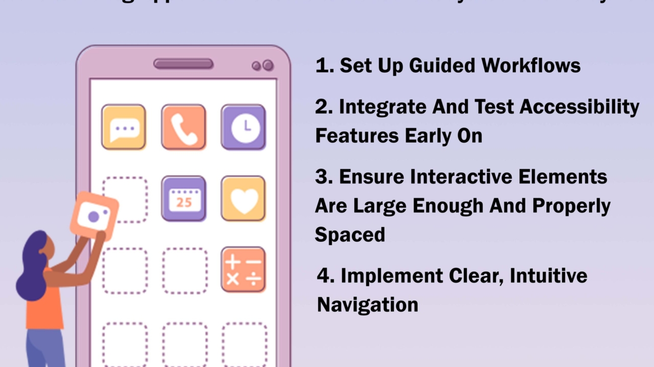
  1. Designing for Visual Accessibility

Color Contrast: Ensure sufficient contrast between text and background colors to make content readable for users with visual impairments. Tools like the WCAG Color Contrast Checker can help evaluate color contrast.

Scalable Text: Allow users to adjust text size without loss of content or functionality. This helps users with low vision read content more easily.

Alternative Text for Images: Provide descriptive alternative text (alt text) for images, which screen readers can read aloud. This is essential for users with visual impairments to understand the content and context of images.

Avoiding Relying Solely on Color: Do not use color as the only means of conveying information. For example, in addition to using color to indicate errors, also provide text descriptions.

  1. Designing for Auditory Accessibility

Captions and Transcripts: Provide captions for video content and transcripts for audio content. This makes the content accessible to users who are deaf or hard of hearing.

Visual Indicators: Use visual cues alongside audio alerts to ensure that users who cannot hear sound notifications are still aware of important information.

  1. Designing for Motor Accessibility

Keyboard Navigation: Ensure that all interactive elements (buttons, links, forms) can be navigated and activated using a keyboard. This is crucial for users who cannot use a mouse.

Touch Target Size: Design touch targets (buttons, links, etc.) to be large enough for users with motor impairments to tap accurately. A minimum target size of 44×44 pixels is recommended.

Gesture Alternatives: Provide alternatives to gesture-based interactions, such as offering buttons or other UI elements for actions like swiping.

  1. Designing for Cognitive Accessibility

Clear and Simple Language: Use plain language and avoid complex sentence structures. This helps users with cognitive impairments understand the content.

Consistent Navigation: Maintain a consistent layout and navigation structure throughout the app. This reduces cognitive load and helps users find what they need.

Error Prevention and Recovery: Design forms and processes to prevent errors and provide clear, understandable error messages when they occur. Allow users to easily recover from errors.

  1. Cultural and Linguistic Inclusivity

Multilingual Support: Offer content in multiple languages to cater to a diverse user base. Use professional translation services to ensure accuracy.

Cultural Sensitivity: Be mindful of cultural differences in imagery, colors, symbols, and language. Avoid content that may be culturally inappropriate or insensitive.

Right-to-Left Language Support: Ensure the app supports right-to-left (RTL) languages like Arabic and Hebrew. This includes proper alignment and text flow.

Testing and Validation

Testing is a critical step in ensuring accessibility and inclusivity. Developers should conduct both automated and manual testing to identify and fix accessibility issues.

Automated Testing Tools: Tools like Axe, Lighthouse, and WAVE can help identify common accessibility issues, such as missing alt text or low color contrast.

Manual Testing: Manual testing by individuals with disabilities provides invaluable insights into the user experience. This can include usability testing with screen readers, keyboard navigation tests, and feedback from users with different disabilities.

User Feedback: Collect feedback from a diverse group of users, including those with disabilities, to understand their needs and challenges. Use this feedback to make necessary improvements.

Accessibility Audits: Conduct regular accessibility audits to ensure ongoing compliance with accessibility standards and guidelines.

The Role of Inclusive Content

Beyond technical aspects, the content within the app also plays a significant role in accessibility and inclusivity.

Diverse Representation: Include diverse characters, voices, and perspectives in your content. This helps all users see themselves reflected in the app and fosters a sense of belonging.

Inclusive Language: Use inclusive language that respects all users, regardless of gender, ethnicity, disability, or other characteristics. Avoid stereotypes and biased language.

Content Customization: Allow users to customize content according to their preferences, such as adjusting font size, color schemes, and language settings.

Benefits of Accessible and Inclusive Apps

Creating accessible and inclusive apps offers numerous benefits, including:

Wider Audience Reach: By catering to the needs of users with disabilities and those from diverse backgrounds, you can reach a broader audience.

Enhanced User Experience: Accessible and inclusive design improves the overall user experience, making the app more intuitive and user-friendly for everyone.

Positive Brand Image: Demonstrating a commitment to accessibility and inclusivity enhances your brand’s reputation and fosters customer loyalty.

Legal Compliance: Adhering to accessibility standards helps avoid legal issues and potential lawsuits.

Increased Engagement: Users are more likely to engage with and recommend an app that meets their needs and provides a positive experience.

Innovation and Creativity: Focusing on accessibility and inclusivity encourages innovative thinking and creative solutions, leading to better overall design and functionality.

Conclusion

Building apps with a focus on accessibility and inclusivity is not just a technical requirement but a moral and ethical imperative. It ensures that all users, regardless of their abilities or backgrounds, can access and enjoy the digital world. By following best practices in accessible and inclusive design, developers can create apps that are not only compliant with legal standards but also offer a superior user experience. The benefits of such an approach are manifold, including a wider audience reach, enhanced brand reputation, and increased user satisfaction. Ultimately, accessible and inclusive apps contribute to a more equitable and inclusive society, where everyone has the opportunity to participate fully in the digital age.

Address: 15th floor, Manjeera Trinity Corporate, KPHB, Hyderabad 500072

Mobile No.:+91 7981728810

Email id: info@skywebdev.in

Website: https://skywebdev.in/


web51

Why Mobile Optimization is Crucial for Modern Websites

Why Mobile Optimization is Crucial for Modern Websites

Introduction

In our mobile-first world, website design needs to focus on user experience for mobile devices. Mobile optimization is very important for businesses to succeed online. It means making website features work well on smartphones and tablets. This change from using desktop computers to mobile devices shows how users now interact with online content.


The Rise of Mobile Browsing in India

India has seen a big rise in mobile internet usage. This makes it one of the largest mobile markets in the world. The easy access to and low cost of smartphones support this growth. This trend shows how important mobile optimization is for businesses that want to reach the Indian market.

Statistics on Mobile Internet Usage

India has the title of the second-largest internet market in the world. There are many active internet users in the country. A large number of these users depend on mobile devices to go online. Many reports show that a big part of internet users in India uses only mobile devices for internet access. This shows a great chance for websites that are designed to work well on mobile. These sites can effectively reach Indian consumers.

Understanding Mobile Optimization

Mobile optimization makes sure a website is easy to use and works well on different mobile devices. This means adjusting it for smaller screens, touch navigation, and various mobile browsers. Today, it’s not just a choice; it’s a must in the digital world.

What is Mobile Optimization?

Mobile optimization is the way to improve your website so it works well on mobile devices. It is more than just making the content fit on a small screen. The goal is to give mobile users a smooth and enjoyable experience. This means making the pages load faster, enhancing navigation for touch screens, and making sure it works with different operating systems and mobile browsers.

Key Elements of a Mobile-Optimized Website

A mobile-optimized website needs a design that fits well on any screen size. It’s important to make images and code smaller. This helps the page load faster and keeps mobile users interested. Clear and simple navigation menus for touch use also make it easier to browse on mobile. These features improve user experience, which is good for SEO and conversions.

The Impact of Mobile Optimization on User Experience

A good user experience leads to more engagement and better conversion rates. When businesses focus on mobile optimization, they can make a website that is fun to use and easy to navigate for everyone, no matter what device they have.

Improved Site Accessibility on Mobile Devices

For many people, using the internet mainly on their mobile device is common. If you make your website better for mobile, it becomes easier for these users to access it. Text that is simple to read, buttons that are the right size for tapping, and pages that load quickly all help create a good user experience. This can result in visitors staying longer on your site and coming back again.

Enhancing User Engagement Through Smooth Navigation

Mobile optimization means making websites easier to use on phones and smaller screens. It is important to have a simple menu design, clear buttons, and easy steps to follow. This helps people navigate smoothly on their mobile devices. When navigation is better, user engagement increases because browsing becomes more enjoyable.

The Role of Page Speed in Mobile User Satisfaction

Mobile users usually do not like slow-loading websites. It’s important to make sure your site loads quickly on mobile devices. This is key for keeping users happy and making your website successful. If your pages take too long to load, potential customers might leave and have a bad view of your brand. By focusing on site speed, you show that you care about your customers. This can help them stay longer on your site.

Mobile Optimization and Its SEO Benefits

In today’s world where mobile-first indexing is important, search engines focus on websites that work well on mobile devices. Using mobile optimization techniques can greatly improve how visible your website is on search results pages. This means having a mobile-optimized website is not only good for users but also helps your business be seen better.

Boosting Search Engine Rankings

Search engine algorithms look at many things when deciding how to rank websites. Mobile optimization is a key factor. When a website is designed for mobile devices, it shows search engines like Google that you care about user experience. This can help boost your search engine rankings. As a result, more potential customers can find your website when they search for products or services like yours.

Mobile-First Indexing by Google

Google mainly uses the mobile version of a website for indexing and ranking. This means that if your desktop version is great but your mobile version isn’t, it can hurt your SEO. By making your website mobile-friendly to fit Google’s mobile-first method, you help it get indexed and ranked better. This adds to your visibility and reach.

Reducing Bounce Rates with Mobile Optimization

Bounce rate is the percentage of visitors who leave your website after looking at just one page. It is an important number in SEO. If your bounce rate is high, especially from mobile users, it tells search engines that your site may not be giving a good user experience. Mobile optimization can help fix this. When your website is easy for mobile users to navigate, they can find what they need quickly. This improves engagement and shows search engines that the user behavior on your site is positive.

How Mobile Optimization Influences Conversion Rates

Improved mobile optimization leads to a better user experience. This can greatly change conversion rates. Having a smooth and engaging mobile website makes it easier for potential customers to navigate. When users find it simple to complete their tasks, it helps your business in the long run.

Mobile Shopping Trends in India

The popularity of shopping on mobile phones is growing in India. People are using their smartphones to easily look for and buy different products and services. If businesses improve their websites for mobile shopping, they can take advantage of this trend. This will make it easier for potential customers to shop and buy using their phones.

Case Studies: Success Stories of Mobile Optimization

Many brands in different areas have seen a big rise in conversion rates after they focused on mobile optimization. For example, Amazon and Flipkart showed significant growth in mobile sales after they improved their mobile websites and apps. These examples show how mobile optimization can really help businesses succeed.

Implementing Mobile Optimization Strategies

There are different ways to get good mobile optimization and enjoy its benefits. You can either redesign your website or use certain techniques. The main goal is to provide a friendly and engaging experience for your mobile visitors.

Responsive Design: A One-Size-Fits-All Approach

Responsive design is a common way to build websites. It makes the website change its layout and content based on the size of your screen. This means you do not need different websites for each device. Responsive design helps create a consistent brand experience. It also ensures that people can easily access and enjoy your website content, whether they are using a smartphone, tablet, or desktop.

Accelerated Mobile Pages (AMP): Speeding Up Content Delivery

Accelerated Mobile Pages (AMP) are very important for improving user experience. They help load content quickly on mobile devices. When web pages use AMP, they load faster, which is great for mobile users who want things ready now. AMP also helps websites rank better in search engines and keeps people from leaving the page too soon. This shows how important mobile optimization is for a smooth user experience. By using AMP, websites can give mobile users a fast and fun way to interact. This can increase user engagement and make the whole site work better.

Mobile-Friendly Forms and Call-to-Action Buttons

Forms and call-to-action buttons need to be made for mobile users. Make sure the form fields are big enough so they are easy to fill out on touchscreens. Also, place the CTA buttons where they stand out and are easy to click. Simple forms that are easy for potential customers to use can help boost sales. This makes it simpler for people to contact you or buy something.

Challenges in Mobile Optimization

Mobile optimization offers many benefits, but it can also have some difficulties. It is important to overcome these problems to unlock the full potential of a mobile-friendly website. Luckily, using best practices and tools can help solve these issues effectively.

Overcoming Common Mobile Optimization Obstacles

A common problem is making sure your website works well on many mobile devices and operating systems. It’s important to test your website on different devices and screen sizes. This helps find and fix any problems with how the site looks or works. Also, mobile technology changes all the time. Keeping your website updated to match these changes can be hard, but it’s needed for good mobile optimization.

Ensuring Compatibility Across Various Devices and Browsers

The world of mobile devices is varied. It includes many gadgets, operating systems, and web browsers. You need to make sure your website works well on all these platforms. It is important to use testing tools that work across different devices and follow web development guidelines. Also, keep track of the latest browser updates and device details. This helps you tackle any compatibility problems before they happen.

Conclusion

In conclusion, mobile optimization is more than just optional now. It is vital for websites to do well online. Many people use their mobile devices to browse the internet. Because of this, you need to make sure users have a smooth experience on all devices. The advantages are clear. Better access to your site means more user engagement and higher search engine rankings. You can use strategies like responsive design and AMP to improve mobile optimization. This will help you reach a larger mobile audience and increase sales. Focus on mobile optimization, and you will see a positive change in your website’s performance.

Address: 15th floor, Manjeera Trinity Corporate, KPHB, Hyderabad 500072

Mobile No.:+91 7981728810

Email id: info@skywebdev.in

Website: https://skywebdev.in/



aug-2-sky-5[1]

How to Design a User-Friendly Interface for Your Mobile App

How to Design a User-Friendly Interface for Your Mobile App

Introduction

In today’s digital world, mobile apps are very important for both businesses and people. A good mobile app is not just about working well – it also focuses on how users feel when using it. This is where UI design plays a key role. The user interface (UI) includes all the visual parts that users see and touch, influencing their experience. This simple guide will help you learn how to design a mobile app interface, even if you have never done it before. 


Preparing to Design Your Mobile App Interface

Before starting the design process for your mobile app, you need to prepare well. This means collecting the tools and resources you will need. You should also learn about your target audience’s needs and what they like.

It’s important to know the platform guidelines for both iOS and Android. This way, your design will fit the specific rules and best practices for each system. By preparing beforehand, you will make the design process easier and create a better mobile app interface for users. 

The Beginner’s Guide to Designing a Mobile App Interface

To design a mobile app interface, follow these steps. This guide shows you each part. It starts with defining what your app is for and ends with getting the design ready for development. You will find helpful tips and ideas to make a mobile app interface that is easy to use and looks good. This is great, even if you are just starting out.

Step 1: Defining the Purpose of Your App

Before you start making visuals, it’s important to know what your app does. What issue does it fix? What benefits does it bring to your target audience? Knowing the main goal of your app will help guide the whole app design process. This way, all your design choices will fit with your product design and goals.

Think about the features and tools that will help your users the most. Write a short and clear app brief. It should explain the app’s purpose, who it’s for, and its key features. This will keep your design process focused.

Having a clear purpose is key for your mobile app design. It helps you decide which features are most important. It also helps you create a smooth user experience. Lastly, it ensures your app meets the needs of your target audience.

Step 2: Researching Current Design Trends

Staying updated on the latest UX and UI design trends is key for making a good app. You should learn about popular design features, color choices, and navigation methods used in successful mobile apps.

Look closely at your competitors’ apps. Check what they do well and what they don’t. Their user interface design, navigation flow, and overall user experience can give you helpful tips. While it’s okay to get ideas from these designs, aim to create a unique and memorable experience for your users.

Studying design trends will help you choose the right visual style and interactions for your app. This way, you can make sure it meets the expectations and preferences of users today.

Step 3: Sketching Initial Design Ideas

With a clear goal and knowledge of design trends, it’s time to visualize your ideas. Sketching is a great way to explore different visual designs for your new app. Don’t worry about making it perfect right now. Focus on putting your ideas on paper.

Try out different layouts, navigation options, and where to place elements. Think about how users will move from one screen to another. Use arrows to show changes between screens and write notes on your sketches.

Sketching helps you work quickly and try out many ideas before using digital design tools. It is the first step in turning your initial thoughts into real visual designs.

Step 4: Creating a Basic Wireframe

Once you’ve drawn your first ideas, it’s time to make wireframes. A wireframe is a simple outline that shows how your app’s interface will look. It is mainly about how the app will work and where the content will go. The look and feel are not the main focus.

You can use a wireframing tool or just pen and paper to draw each screen of your app. Show where important things like menus, buttons, images, and text boxes should go. Wireframes work like blueprints, helping guide the design process and making sure each screen connects well.

Making wireframes is an important step in mobile app design. They give a clear plan for the next steps in design and development. They help find possible usability problems early on and build a strong base for your app’s user interface.

Step 5: Selecting a Color Scheme and Typography

Choosing the right colors and fonts is very important for your app’s look and feel. It helps show your brand identity and makes it easy to read. Pick colors that fit your brand and bring out the feelings you want. For instance, blue is trustworthy, and green is about growth.

Fonts are also key for how easily people can read your app. Use font types that are easy to read on small screens and match your app’s style. Keep the sizes and styles of the fonts the same all through the app for a better visual experience.

Good colors and fonts help people remember your brand and make your user interface look nice and balanced.

Step 6: Designing the Core Features and Navigation

With the basic setup and look of your app ready, it’s time to start designing the main features. Focus on the features that are most important to the purpose of your app. Make sure these features are easy to use, friendly for users, and visually appealing.

Navigation is very important in mobile app design. It helps users move smoothly between different parts of your app. Use clear and simple navigation tools, like bottom bars or side menus, so users can find what they are looking for easily.

By concentrating on core features and clear navigation, you will create a smooth and pleasant experience for users. Always remember their goals and design features that meet their needs and what they expect from the app.

Step 7: Prototyping Your Design

Prototyping makes your design real by creating models that act like your app. Prototypes help you test how users will flow through the app. They also let you find any issues and improve the user experience (UX design) before you start making the app.

You can make simple prototypes with paper or basic software. If you want, you can create more detailed prototypes that look very similar to the final app. These detailed prototypes often have animations, transitions, and interactive features, which give a more real feel to users.

Prototyping is a process that lets you get feedback, make changes, and improve your design based on what real users say and do. This step is very important to make sure your app is easy to use and fits the needs of your target audience.

Step 8: User Testing and Feedback Collection

User testing is an important part of the mobile app design process. It helps you get feedback from real users and find ways to improve the app. You should find people from your target audience and ask them to do specific tasks in your app prototype.

Watch how they use the app, ask what they think, and encourage them to be honest. Look for any problems they face, things that confuse them, or their ideas for improvement. The feedback from users is very important for spotting and fixing usability issues.

By doing user testing and collecting feedback, you learn how users interact with your app in the real world. This information helps you check if your app design is good, find parts that need to be better, and create a more user-friendly mobile app experience.

Step 9: Iterating Based on Feedback

Based on the feedback from user testing, it’s time to improve your mobile app interface. Look at the insights you gathered, find the most important issues, and think of solutions for better design.

Improving involves going back to earlier steps in the design process. You may need to change the layout, improve navigation, or adjust the visual design. The aim is to respond to user feedback, make the app easier to use, and create a more enjoyable experience.

This process of improvement continues even after you launch your app. Regularly collect user feedback and look at how people use the app. Be ready to make changes based on user actions and changing needs.

Step 10: Finalizing the Design for Development

Once you have used user feedback and improved your design, it’s time to get it ready for development. This means you need to gather all the design files, specs, and documents for the development team. Make sure all your design elements match, assets are organized, and specs are easy to understand.

Give the development team clear design specs. This should include font styles, color codes, image sizes, and how users should interact with it. Make sure the development team fully understands your design vision and the user experience you want to create 

Conclusion

In conclusion, creating a mobile app interface mixes creativity, focus on users, and usefulness. By following the steps in this beginner’s guide, you can build an interface that not only looks good but also gives a smooth user experience. Remember to keep up with design trends, ask for feedback from your target audience, and improve based on user testing to enhance your app interface. Use key design principles like simplicity, consistency, responsiveness, and accessibility to make sure your app connects well with users. With the right tools and hard work, you can design a mobile app interface that stands out and brings joy to users at every interaction.

Address: 15th floor, Manjeera Trinity Corporate, KPHB, Hyderabad 500072

Mobile No.:+91 7981728810

Email id: info@skywebdev.in

Website: https://skywebdev.in/ 


aug-2-sky-3

The Key Elements of a User-Friendly Website Design

The Key Elements of a User-Friendly Website Design

Introduction

In today’s world of digital marketing, user experience is very important. A good website should look nice but also focus on how users move through it. This helps them have a smooth and enjoyable time. This blog post will look at the key parts of user-friendly website design. It will help you build a website that draws in visitors and keeps them coming back.


Understanding User-Friendly Website Design

A user-friendly website is one where visitors can easily find the information they want. They should be able to navigate the site easily and achieve their goals without trouble. A good user-friendly design focuses on being clear, simple, and knowing what the target audience needs.

It is important to create a website that feels easy to use and inviting. This encourages visitors to look around, get involved, and come back again.

Defining a User-Friendly Website

Website usability is key to making a site user-friendly. It means making sure visitors can move around the site easily, find what they need fast, and complete tasks without any problems. A good website keeps the user in mind. It thinks about their needs and offers a simple and smooth way to use the site.

A friendly website gives a positive user experience. People should feel relaxed while browsing. They should be sure they can find the information they want and feel happy with their time spent on the site.

In the end, website usability is very important for the success of any website. A user-friendly site brings in more visitors, encourages them to engage more, helps with conversions, and builds brand loyalty by going beyond what users expect.

The Significance of User-Friendly Designs in Today’s Digital Landscape

In today’s crowded online world, a user-friendly website is essential. Many websites are trying to get attention. A smooth and pleasant user experience can make you stand out from others.

How your site looks and works can influence if a visitor stays, interacts with your content, or switches to another site. Putting a focus on user experience is key for the success and growth of your website.

Driving Conversion Rates Upwards

Conversion rates are important. They show how well your website gets people to shop, sign up, or download something. A good website design can boost these rates. It helps guide your target audience smoothly to their expected actions.

An easy-to-navigate site that looks good and clearly explains your products or services will build trust and confidence. This can lead to more conversions. On the other hand, a bad design can leave visitors confused and frustrated, making them less likely to take action.

So, it is crucial to focus on design that puts users first. You should simplify how people convert on your site and make sure it works well on mobile devices. Every design choice should help your target audience do what you want them to do.

SEO Benefits of User-Friendly Designs

Search engine optimization (SEO) is very important for bringing people to your website. While keywords and backlinks are key parts of SEO, Google also looks at user experience when ranking sites. A website that is easy to use shows Google that it is valuable to visitors. This can improve your search result position.

For instance, having fast loading times is a big part of user experience. Google gives rewards for fast websites. If your website is slow, it can cause more people to leave quickly. This tells Google that users aren’t finding what they want.

By focusing on making your site user-friendly, like ensuring mobile responsiveness and easy navigation, you can better your SEO results. Clear and simple content also helps. This way, you can draw more organic traffic, which will increase your site’s visibility and reach.

Core Components of a User-Friendly Website

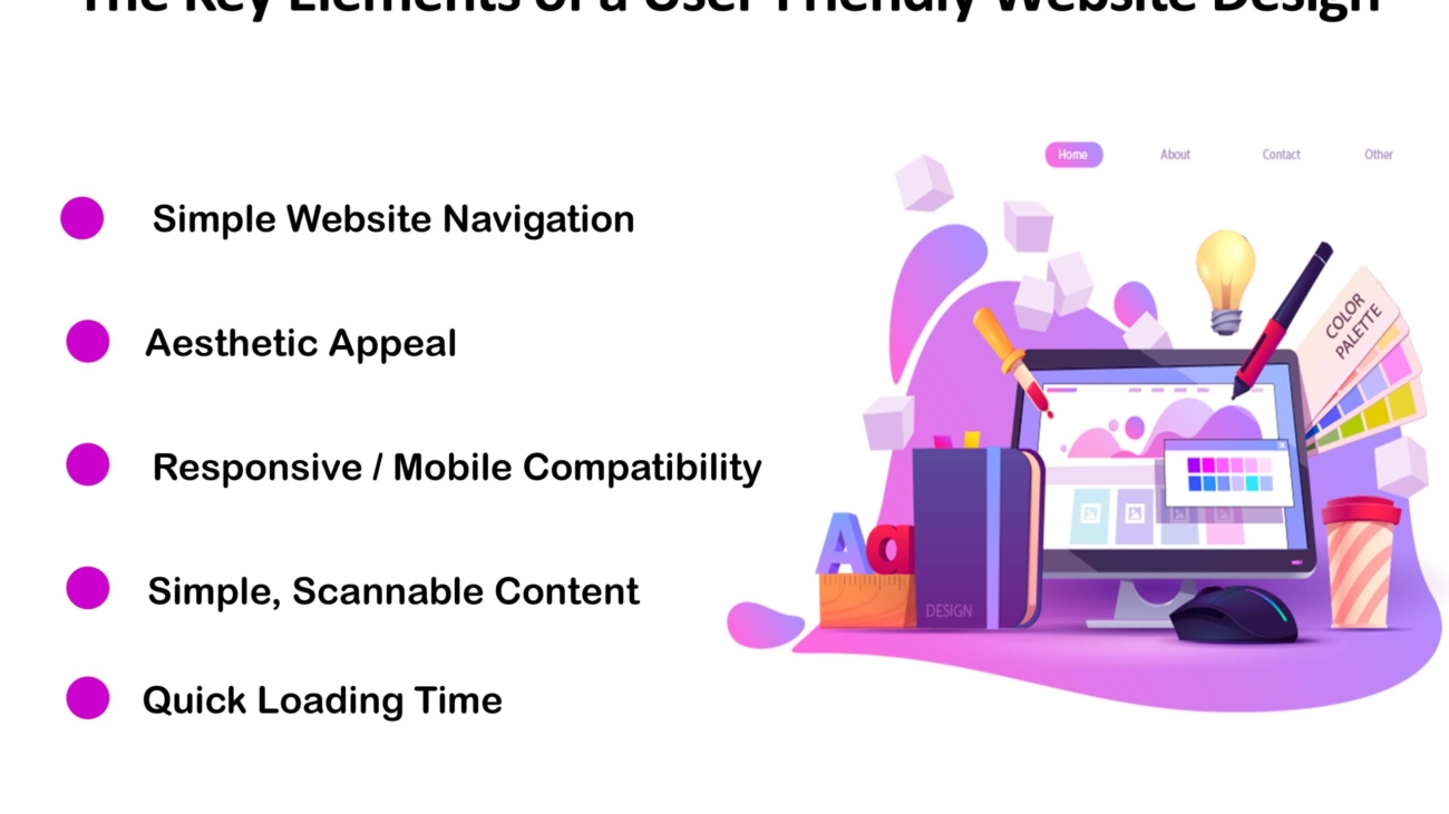
Building a user-friendly website means focusing on important parts that affect how visitors experience it. You should have easy navigation, a responsive design, quick loading times, and accessibility for everyone.

When you make these key components a priority, you create a site that is not only nice to look at but also works well. It will be easy to use and accessible to all, no matter their device or abilities.

Navigation That Users Love

Easy navigation is key to a user-friendly website. When visitors can quickly move between pages, find what they need, and understand how the site works, they tend to have a good experience and stay longer.

Intuitive navigation means making a clear sitemap. It also involves using clear menu labels and keeping navigation tools in the same places on the site. Think of a store where items are easy to find. This is the feeling you want to create online.

A website with intuitive navigation helps users. They can concentrate on the content and connect with your brand. This is important in good UX design. It helps the success of a website by encouraging users to explore, increasing engagement, and improving conversion rates.

Ensuring Mobile Compatibility

In today’s world, having a website that works well on mobile devices is very important. If your website is not mobile-friendly, you may lose many potential visitors.

Responsive design can fix this problem. It means building a website that changes to fit different screen sizes and resolutions. This way, users have a good viewing experience on any device. The text should be easy to read, images should change size, and navigation should be simple on a smaller screen.

A responsive website lets all users, whether they are on desktops, laptops, smartphones, or tablets, see and use the same content and features. It is important to have a good and consistent brand experience across all devices. This helps keep users happy and engaged, which is important for reaching your business goals.

Speed is Key: Optimizing for Faster Load Times

In today’s fast digital world, every second matters. Website speed is very important for user experience. If your website loads slowly, it can frustrate users, cause them to leave quickly, and result in lost chances. Speeding up your website is not just a technical task; it can affect your profits directly.

Many things can affect the speed of your website. These include image sizes, how complex the code is, and the hosting service you choose. A small delay of a few milliseconds may seem minor, but it can really change how users feel and act. Using tools like Pingdom can help you find and fix any issues.

You can make sure your website loads quickly by compressing images, using browser caching, and optimizing your code. This way, visitors will have a smooth and enjoyable experience. Remember, a fast-loading website satisfies users and helps improve your search engine ranking. So, speeding up your site is a smart move for both users and your business.

Accessibility for All: Including Content Accessibility Features

Accessibility in website design means making sure that everyone can use and enjoy your content. This includes people with different abilities. It’s important to create a space online where everyone can see, understand, move around, and take part in the web.

To achieve this, you can add features like alternative text for images, captions for videos, and keyboard navigation. You also need to make sure there is enough color contrast for people with visual impairments. Making your website accessible shows that you care about being inclusive and following good design practices.

When you improve your website’s usability for people with disabilities, it usually makes the experience better for all users. For example, having clear headings, short paragraphs, and descriptive link text helps everyone, not just those using assistive technologies.

Conclusion

A user-friendly website design is very important for a successful online presence. You should focus on user experience by making navigation easy, ensuring mobile compatibility, and having fast loading times. This can help improve engagement and increase conversion rates. Adding accessibility features and clear call-to-action buttons also makes your site easier to use. Use technology tools to create a better user experience, and make sure your design works well on mobile devices. It’s important to look at user feedback regularly so you can keep improving your website. By doing these best practices, you can build a website that attracts visitors and keeps them coming back, helping your online success grow.

Address: 15th floor, Manjeera Trinity Corporate, KPHB, Hyderabad 500072

Mobile No.:+91 7981728810

Email id: info@skywebdev.in

Website: https://skywebdev.in/ 

app52

Top 5 Trends in Mobile App Development for 2024

Top 5 Trends in Mobile App Development for 2024

Introduction

The world of mobile app development is always changing. User needs and new technologies push it forward. To stay ahead, it’s important to adopt the latest app development trends. Mobile apps improve user experience and are changing many industries. Let’s look at the main trends that will shape mobile app development in 2024.


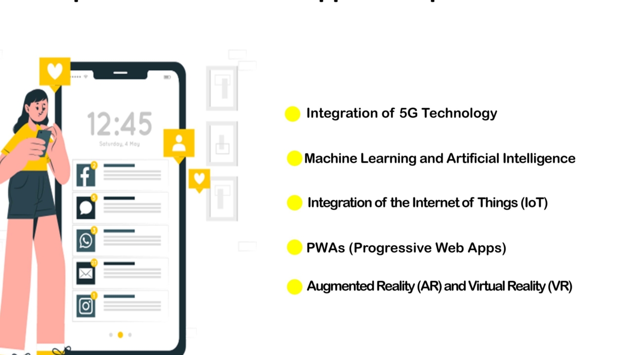
Leading Trends in Mobile App Development for 2024

In today’s digital world, mobile apps play a big role in how we talk, have fun, and do our jobs. Because things change so fast, app developers must keep up. Let’s look at the trends for 2024. We will see how apps will mix with 5G, IoT, AR, and VR. We will also look at the strength of AI and ML and the growing area of mobile commerce.

These trends will change how mobile apps work and change the way users interact with them.

  1. The Rise of 5G Technology and Its Impact on Mobile Apps

The arrival of 5G technology changes everything for mobile app development. It is fast and has very low delay, which improves mobile app performance a lot. Developers can now add complex features without slowing down the app or losing any functionality.

With higher speed and more bandwidth, developers can make apps that use a lot of data and respond quickly. They can now work with real-time data, provide smooth streaming, and offer amazing experiences with augmented reality. This opens up many new possibilities for creative mobile applications.

The quick download and upload speeds of 5G lead to a better user experience. Users can enjoy shorter loading times and smooth app interactions. This gives a big benefit to apps in gaming, streaming, and video calling.

  1. Enhanced Integration with Internet of Things (IoT) Devices

Mobile app development in 2024 is going towards better connections with IoT devices. This approach meets the growing need for apps that work well together across different platforms. By using IoT technology, apps can give users a smooth and easy experience by using real-time data and connecting with devices. This trend shows how important it is to keep up with technology changes. It makes sure that mobile apps stay innovative and convenient for users.

  1. Revolutionizing User Experience with Augmented Reality (AR) and Virtual Reality (VR)

Augmented Reality (AR) and Virtual Reality (VR) are changing the way people use mobile apps. These technologies make experiences more exciting, which leads to better customer engagement and satisfaction. In 2024, app developers will focus on adding AR and VR to their work. This will help them create fun and fresh apps. From gaming to trying out products virtually, AR and VR are changing how users connect with mobile apps. This opens up new opportunities for businesses to offer special and personal experiences.

  1. Advancements in Artificial Intelligence (AI) and Machine Learning (ML) for Smarter Apps

Advancements in artificial intelligence (AI) and machine learning (ML) are changing how we build mobile apps. These technologies help developers make apps that work better and fit user needs. With AI and ML, apps can learn what users like and give them personalized options. This can improve app performance and make processes smoother. In the busy mobile app industry, using AI and ML is a top priority. This helps developers keep up with changing consumer demands and stay ahead of their competitors.

  1. The Growth of Mobile Commerce and Secure Payment Solutions

Mobile commerce is growing very fast because more people are using smartphones. Users enjoy the ease of shopping on their mobile phones. As a result, businesses are putting effort into creating secure and easy-to-use mobile commerce apps. Having secure payment options is very important for building trust and encouraging users to try mobile payments.

Mobile wallets like Apple Pay and Google Pay are becoming more popular. They give users a safe and simple way to pay within mobile commerce apps. Adding biometric methods, such as facial recognition and fingerprint scanning, makes payments safer and speeds up the checkout process.

To succeed in mobile commerce, businesses should focus on making the shopping experience personal. They can do this by offering loyalty programs and using chatbots for customer support. It’s also important to make the checkout process quick and secure.

IoT Device Integration in Mobile Apps

The Internet of Things (IoT) is changing how we use technology. Mobile apps play a key role in this change. They connect users to their devices, making life easier. You can control smart home devices or manage wearable technology through these apps.

This is not just about control; it also allows data to be shared and analyzed. This creates a more personal experience for users. For example, think of a fitness app that changes workouts based on information from your smart watch. Or consider a home security system that sends alerts to your phone in real time.

Examples of IoT-Enhanced Mobile Applications

The mixing of IoT devices and mobile applications shows a future where everything connects easily. Daily objects will become a part of our digital lives. Here are some examples:

Smart Home Applications: Smart home apps are a great example. These apps let users control many parts of their home from their smartphones. Users can change lighting, keep an eye on security cameras, set the thermostat, and run smart appliances. This kind of control makes life easier, saves energy, and offers safety to users.

Healthcare and Wearable Tech: The healthcare field gains a lot from using IoT. Mobile apps can interact with fitness trackers and medical tools. This gives users updates on their health right away. These apps can even share data with doctors, allowing for remote monitoring and better treatment plans.

Future Prospects of IoT in Mobile App Development

The blend of IoT and mobile apps is a growing trend that can change how we live and connect with our environment. As more devices link up, the need for smart mobile applications that can manage and control these devices will increase.

A key goal will be to create safe and dependable apps that protect user privacy and data. With more connected devices, it is very important to keep user data safe while it travels and stays in the IoT system.

Another key point is to make sure different devices and platforms work well together. As the IoT world grows to include many brands and devices, building mobile apps that can communicate easily across various platforms will be vital.

Exploring AR and VR Technologies in Mobile Apps

AR and VR mobile app development is changing how we experience things. They mix the real world with digital elements. AR adds digital images to what you see, and VR takes you into whole new worlds.

These technologies lead to fun interactive games that change with your space and cool virtual try-ons for shopping online. AR and VR create new ways to get people involved and improve their experience. They have a lot of power to change how users work with their mobile apps.

The Impact of AR and VR on User Engagement

AR and VR are changing how people interact with apps. They offer fun and exciting experiences that go beyond just looking at a screen. With these technologies, mobile apps can connect with the real world, making the user experience much better.

For example, stores use AR to improve shopping. You can try on clothes virtually or see how furniture will look in your house before buying it, all through an app. This kind of interaction helps people engage more and can lead to more sales for businesses.

In gaming, AR and VR give players amazing experiences. AR games like Pokémon GO mix digital characters with the real world, encouraging users to go outside and explore. VR games can take users to new worlds, creating an experience that feels like a top-tier gaming console.

Conclusion

In conclusion, the trends that will impact mobile app development in 2024 are very exciting and important. The use of 5G technology and the growth of AI, IoT, AR, and VR are changing mobile apps fast. These improvements will lead to better user experiences, more personal interactions, and safe transactions. Developers need to keep up with these trends and include them in their app development plans to remain strong in a changing digital market. Using these new technologies will boost innovation and improve user satisfaction and engagement. Exciting times are ahead for mobile app development!

Address: 15th floor, Manjeera Trinity Corporate, KPHB, Hyderabad 500072

Mobile No.:+91 7981728810

Email id: info@skywebdev.in

Website: https://skywebdev.in/


aug-2-sky-6

The Importance of User Experience (UX) in Mobile App Design

The Importance of User Experience (UX) in Mobile App Design

Introduction

In today’s world, where many apps are trying to get people’s attention, making the user experience easy and fun is very important. UX design has a key role in how users see and use a mobile app. It aims to improve how easy it is to use, how accessible it is, and how happy users feel. This way, users can enjoy every interaction and see the value in it.

Understanding the Fundamentals of UX in Mobile Apps

User experience includes everything about how a user interacts with a mobile app. This starts from when they download the app and goes on to how they use it over time. The goal is to make the journey easy, enjoyable, and helpful. It needs to meet user needs and even go beyond what they expect.

Good UX design looks at user research, how information is organized, how users interact, and the visual look of the app. This way, it creates a smooth and friendly experience for users on mobile.


Defining User Experience and Its Components

User experience (UX) is more than just how the app looks. UI design mainly focuses on the visuals and how they are shown. UX design includes everything about how a user interacts with the app. This covers their feelings, thoughts, and actions while using it.

A good UX strategy looks at a few important things, such as:

Usability: Is it simple for users to move around the app and reach their goals?

Accessibility: Can people with different abilities and needs use the app?

Engagement: Does the app keep the users interested and make them want to come back?

Value: Does the app really help users and solve their problems?

By focusing on these parts, UX designers can create mobile experiences that are nice to look at and also satisfy and meet what users need.

Why UX is Critical for Mobile App Success in India

In a fast-growing mobile market like India, knowing what local users need and want is key for mobile app success. UX design gives helpful insights into user habits, cultural details, and market trends. This lets developers build apps that connect well with their target audience.

Having a clear UX strategy is important. It helps create mobile apps that are easy to use, fun, and important to Indian users. This means doing good user research to learn about cultural influences, language choices, and technology needs in the Indian market.

By focusing on these factors, businesses can boost user engagement, increase app downloads, and build a strong brand in the busy Indian mobile world.

Key Elements of Effective UX Design for Mobile Apps

Creating good UX design for mobile apps needs a complete approach. You have to think about different parts that help make the user experience smooth and enjoyable.

This means you should focus on easy navigation, clear layout of information, and good-looking design. It’s also important to have a design that responds well to different screen sizes and directions.

Simplifying Navigation for Enhanced User Flow

Intuitive navigation is very important for a smooth user experience. Users should be able to move through the app easily and find the information they need quickly. To achieve this, we need:

Clear Information Organization: This means putting the app’s content and features in a simple, logical way.

Easy-to-Use Menu Options: We should use familiar ways to navigate, like hamburger menus, tab bars, or bottom navigation, to make exploring simple.

Expected Navigation Path: Users should know where each action will take them in the app. This helps to reduce confusion and frustration.

When designers focus on intuitive navigation, they create a user-friendly space that boosts user satisfaction and drives engagement.

Incorporating Feedback Systems for Continuous Improvement

Continuous improvement is key for good UX design. Adding ways to get feedback in the mobile app helps developers learn from real users. This way, they can change the design based on what users experience.

Feedback can come in many forms, like:

In-app surveys and polls

User reviews and ratings

Bug reporting tools

User behavior analytics

By gathering and checking user feedback, developers can find problems, fix usability issues, and keep making the overall user experience better.

The Role of UX in the Mobile App Development Lifecycle

Integrating UX design in every step of mobile app development is important for making successful apps that focus on users. This involves having UX designers from the very start. They should take part in the planning, development, testing, launch, and even after the app is live.

Integrating UX from Conceptualization to Launch

Involving UX designers from the start of the development process is important. It makes sure that user needs and wants are taken into account at every step. This means they work together with product managers, developers, and other key people. They help define user profiles, carry out user research, and create wireframes and prototypes.

During the development phase, UX designers are key to making sure the design idea becomes the final product. They team up with developers to make sure the user interface is easy to use, accessible, and meets usability standards.

Ongoing testing and improvements during development are needed to find and fix any usability problems before the app is launched.

Collaborative Efforts Between UX Designers and Developers

Effective UX design needs good teamwork between UX designers and app developers. This teamwork helps make sure that design choices are possible to achieve. It also ensures that the end product meets both the look and the function of the app.

It’s important to have open communication, a shared understanding of user goals, and a method to solve problems together for success. Developers should welcome design feedback. They should also be ready to improve technical parts based on what is found about usability.

By creating a team-focused environment, businesses can make sure that UX choices fit well into the development process. This leads to a user-friendly and successful mobile application.

Conclusion

User experience (UX) is very important for mobile app design. To make a good app, you should understand cultural differences, make navigation easy, and include ways for users to give feedback. If UX is bad, users may stop using the app and think poorly of it. By using technology like AI for personalization, and by making sure the app is fast and responsive, developers can improve the app experience. In India, user tastes differ, so it’s important to tailor UX design to meet their needs. By focusing on UX all through development, from the idea stage to launch, app designers can create experiences that users will enjoy.

Address: 15th floor, Manjeera Trinity Corporate, KPHB, Hyderabad 500072

Mobile No.:+91 7981728810

Email id: info@skywebdev.in

Website: https://skywebdev.in/